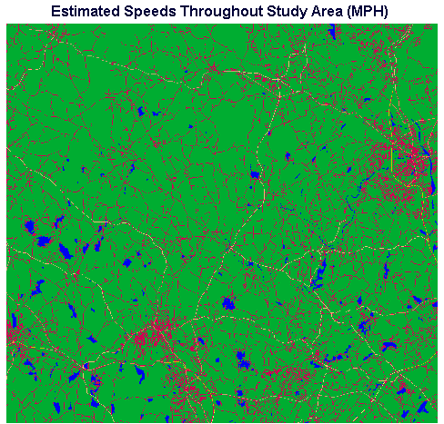
Figure 3. Raster Image in which Each Pixel's Value Corresponds to Travel Speed Across It.
In recent years the health care delivery system has been subjected to considerable economic pressure. As a consequence, many care facilities have been closed or consolidated with other facilities. In evaluating the potential closure of health care facilities there are issues of fiscal solvency and profit, but there are also issues concerning the clients or potential clients of the facility. Who will be affected? Where are the affected people located? How many people will be affected? To what extent will they be affected? If we are faced with the potential closure of a facility, how do we compare the current scenario, in which the facility exists and serves the community, with the proposed scenario in which the facility has been closed and its patients have been relegated to other facilities? Obviously, these are difficult questions to answer with certainty. In this study, GIS attempts to answer these questions by modeling the travel time to health care facilities and by exploring the implications of the travel time analysis for providing quantitative answers. We determined what portions of the study area would contribute patients to each hospital based on travel time - we call this the "catchment area" of the hospital. We compared the catchment areas determined for both scenarios, one in which a primary health care facility exists and one in which it has been closed. Once we determined the catchment areas for the hospitals for each of the two scenarios, we used those catchment areas and some rudimentary local population statistics to make estimates of how many people were involved and where they were located.
When it was announced that a local full-service hospital (Burbank Hospital, Fitchburg, Massachusetts) was being considered for closure as part of a consolidation and restructuring plan, a number of area residents expressed concern. Many people were worried that if the nearby hospital was closed, the increase in time necessary to reach the nearest emergency care facility could prove to be life-threatening in an emergency. The study described here was conducted to examine and document the effect of the proposed closure of Burbank Hospital on travel time to emergency care facilities. The locations and numbers of potentially affected residents were also considered. The results of the study were presented to the State board required to approve of hospital closures and, ultimately, for a number of reasons beyond the scope of this article, Burbank Hospital was kept open.
This article presents the methods used in the Burbank Hospital study and summarizes the results obtained. The investigation will be examined in two parts: first, the travel time evaluation, and second, determining the number of people affected, based on the travel time analysis. After preliminary data preparation, two scenarios were examined, the situation in which Burbank Hospital existed, and the situation in which Burbank Hospital no longer existed. Travel time determination, and all other modeling was performed identically for each of the two conditions. This approach allowed us to estimate (and to test) which, for any location in the study area, was the travel-time-based nearest hospital, and how long it would take to get there - with Burbank Hospital existing, or not existing. In this way, we could compare the two scenarios, and document some of the consequences of proceeding from the Burbank-existing scenario to the Burbank-closed scenario.
These assumptions clearly do not hold true in all circumstances. For example, people may not be aware, or may be wrong about which facility can be reached in the shortest time. Or people may tend to go to the facility that is closest to work or school, regardless of where they live. A town that has a higher proportion of elderly residents may have a correspondingly larger number of hospital visits, hence a greater sensitivity to hospital accessibility differences than another town which has a smaller proportion of elderly residents. Also, speed-limit-based travel time estimates in this investigation may not characterize travel times of concern, e.g., travel time by emergency vehicles in emergency situations.
Additional assumptions were made which will become evident during the course of the analysis - such as the notion that population is uniformly distributed throughout each town. We will attempt to point out the points at which such assumptions were made as we work through the analysis. Each of these assumptions constitutes an area in which the kind of analysis demonstrated here can be questioned and improved.
The data sets which provided the basis for the study consisted of the following:
These types of data are readily available (in the United States and possibly other areas) at little or no cost from government sources or bundled with relatively inexpensive software. Alternatively, the rudimentary data used here could be digitized from maps and obtained from a trip to the library. Given that the data used here is widely available, and in the interest of concentrating on the analysis demonstrated in this exercise, little attention is devoted in this exercise to the data acquisition and format conversion.
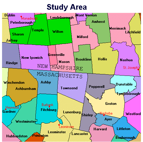
This figure shows the 46 New Hampshire and Massachusetts towns which are entirely or partly contained within the study area. The six hospitals of interest are shown in red.
The TOWNS raster layer in the map composition consisted of a blank raster layer into which the TOWNS vector layer was rasterized. The characteristics of the blank layer, which will provide the template for every step in the analysis, were consciously selected based on the following logic.
The entire study area falls within one UTM zone (Zone 19N). UTM Zone 19N was a reasonable reference system to use (instead of lat/long from which some of the data layers were reprojected) providing for north/south distances on the ground represented at the same scale as east/west distances.
Based on the locations of the surrounding hospitals which defined the region of interest, a north/south span of 44,000 meters (from UTM 253,600m to 301,000m northing) and an east/west span of 47,400 meters (UTM 4,708,100m to 4,752,100m easting) was selected.
A cell (pixel) size of 50m north/south and east/west was chosen, given that such a cell size was adequate for spatial differentiation of features such as roads. Also, a 50-meter cell size resulted in raster sizes of 948 by 880 cells, which was acceptable for the anticipated processing time and storage requirements demanded by this investigation.
Based on these considerations, a blank raster (BLANKIMG.IMG) was prepared. It was used as a template for the blank image into which the TOWNS vector layer was rasterized and for all other images in our analysis. After rasterizing the town polygons into this image, the pixel values were the town polygon identifiers in the vector file from which the TOWNS raster was prepared. These identifiers also provided the link to the TOWNS database, which was referenced for town population, etc.
As the basis for our travel time analysis, we created a raster image depicting the estimated speed in miles per hour across every cell in the raster. From this we derived a raster in which every cell contained a value equal to the predicted time it would take to travel across that particular cell.
(Later, we considered how the speeds/travel times differed depending on whether Burbank Hospital was present or absent. But for this part of the analysis it did not matter what the origins or destinations of travel were. We were defining speed/travel time per cell, which was independent of who was traveling or where they were going...)
We assumed the following:
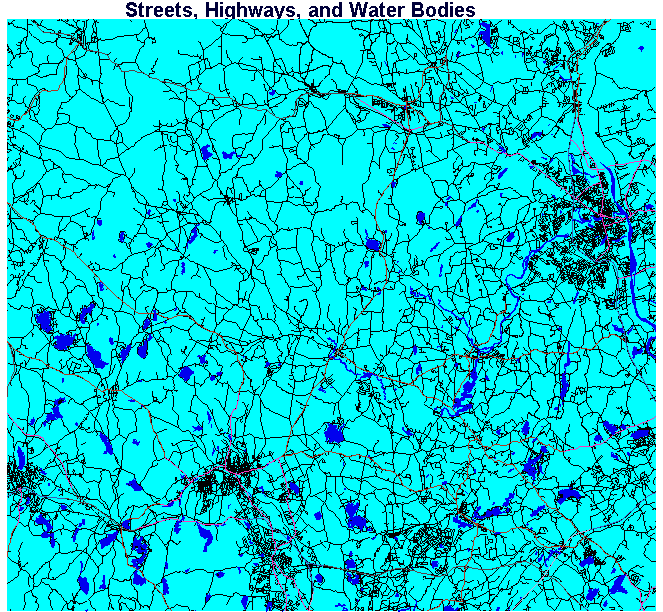
We started with a blank raster, which we created with a value of 5 in every cell, to provide for our assumed background travel speed of 5 mph. Then we rasterized our source data vector layers (water bodies, streets, and highways) into this raster image.
We first rasterized our water bodies vector layer in which every vector feature (water body) had an ID of one. When we rasterize, we can imagine overlaying the vector layer of water bodies over the raster. Every cell in the raster beneath a vector feature (water body) takes on the ID of that feature, in this case a value of one (i.e., one to represent the 1 mph speed value we assumed for travel across water bodies). After we rasterized our water bodies into the blank raster consisting initially values of fives in every cell, there were pixel values of one, in the locations of the water bodies, and fives in areas which did not correspond to water bodies.
Next we rasterized our streets vector layer, in which every feature (street) had an ID of 15, into the same image. After this step we had cells in the image with values of 1, 5, and 15. Finally, we rasterized the highways vector layer. After this step our speeds image contained cells with values ranging from 1 to 65 (corresponding to travel speeds ranging from 1 mph across water bodies to 65 mph on interstate highways).

Figure 3. Raster Image in which Each Pixel's Value Corresponds to Travel Speed Across It.
When rasterizing takes place each cell in the raster takes on the value of LAST vector feature rasterized into it. If we rasterize a street which crosses a particular cell, and then we rasterize a highway that crosses the same cell, the cell will retain the last value rasterized into it, i.e., the highway. Some of the streets in our streets vector layer (all of which had a feature ID of 15) were also included as highways in the highways vector layer (with specific, higher speeds), therefore we rasterize the streets layer first, so the highway feature IDs will overwrite the street IDs whenever the highways fall into the same cells as streets.
If it appears to you that the continuity of a given street or highway is interrupted in Figure 3, bear in mind that this is an artifact of the contraction of the image for display. The rasters of 948 by 880 pixels used for the analysis were thinned by every other pixel to create appropriately sized images for this article. For reference, Figure 3A is included at full size to allow visual confirmation that the fragmentary appearance of linear features is a display artifact.
At this point, we had assigned the travel speed in miles per hour to every cell in our image. The next step in the analysis was to convert this to a travel-time-per-cell image. Once we created such an image, we would use a cost accumulation procedure (the COST module in Idrisi) to sum the travel times from/to the hospitals.
Mathematically, the following steps were applied. Recall that we have 50-meter cells:
1 mile/hr (mph) = 26.822 m/min
multiply the right side by 1 cell/50m leads to :
1 mile/hour = 0.53644 cells/min
and 5 miles/hour = 2.6822 cells/min, etc.
We can safely divide 1 by both sides of the first equation to arrive at:
1 hour/mile: 1.86414 min/cell
and: at 1 hour/5 miles (which equals 5 miles per hour): 0.37283 min/cell, and so forth
The next step was to create an image where pixel values were these per-cell travel times; everywhere a pixel in the ALLSPEED image had a value of 1 mile per hour we substituted 1.86414 min/cell, and everywhere a pixel has a value of 5 mph we substituted 0.37283 min/cell, etc.. We can accomplish this by using a look-up table in performing the substitution (the ASSIGN module in Idrisi was used). The look-up table looks like the following:
At this point, we had produced our travel-time-per-cell image (TIMEPRCL.BMP). If we were to go from any cell in the TIMEPRCL image to any other cell, by adding up the pixel values in every pixel crossed, we could determine, based on predicted speed per cell and the other assumptions in our model, how many minutes the journey would take. Now we were in a position to start evaluating travel times to/from the hospital locations.
Up to this point we created a single travel-time-per-cell map and did not worry about the distinction between a scenario with five hospitals as compared with the six-hospital scenario. From this point on we started comparing the two situations: six hospitals present vs. five hospitals present and Burbank Hospital closed. We began doing every step twice, once for each scenario. For the sake of robust comparison, it was essential that we perform identical treatments of the data layers for both scenarios.
The next step was to specify the source or target locations to/from which travel time should be accumulated. Two vector point files were prepared. HOSPWB contains points for all of the hospital locations including Burbank Hospital. HOSPNOB contains points for the hospitals without Burbank. To perform the cost summation step (in the present case, travel time summation) raster files (not vector files) containing the target locations are required, so the hospital-locations were rasterized into two blank rasters created from our master raster template. One raster was created with all six hospital locations and one with five hospitals (Burbank Hospital absent).
At this point we were ready to calculate travel times to/from the hospitals. We used the COST module. When COST runs, it moves through the image working outward from each source feature. In the present case, the source features are hospitals. As COST moves outward, it accumulates the travel-time-per-cell value in each cell it passes through, choosing the lower-value (least cost) direction as it goes and leaving behind, as the new pixel value, the accumulated travel time. When it moves diagonally, a factor of 1.4 is multiplied by the diagonal moved-into cell value to account for the distance between cell centers in the diagonal case as compared with the orthogonal case. When COST is finished, in any cell in an image, the pixel value represents the accumulated cell values (with diagonal factors as appropriate) calculated along the least-cost pathway from the source point to each cell. Where there are multiple source features the value in each pixel will be the accumulated cost along a least cost path from the closest (based on cost) source feature. In the present one case, where there are multiple hospitals as source features, the value in each pixel will be the accumulated travel time along the least-travel-time route to the hospital the least-travel-time away from that pixel.
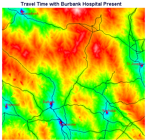
Figure 4. Travel Times with Burbank Present
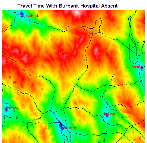
Figure 5. Travel Times with Burbank Absent
Note that in Figures 4 and 5 the highways vector layer has been superimposed to provide geographic reference.
It is easier to interpret the travel time map if, instead of displaying a continuous range of values, the image is categorized into travel time intervals. The RECLASS module in Idrisi was used to perform the quantization.
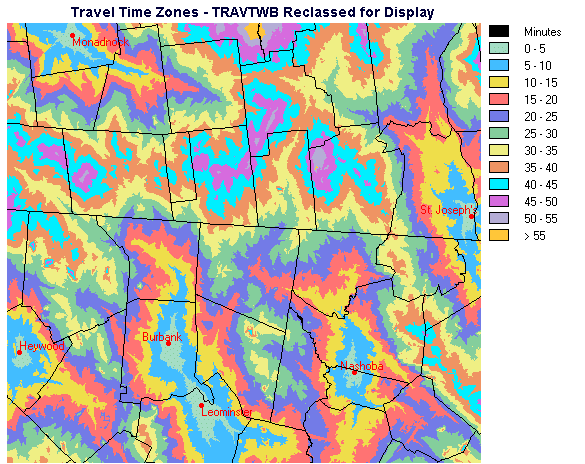
Figure 6. Reclassified Travel Times with Burbank Present
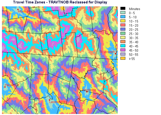
Figure 7. Reclassified Travel Times with Burbank Absent
Note that in Figures 6 and 7 the town boundaries vector layer has been superimposed to provide geographic reference.
Comparing the two travel time maps, one can see that it is primarily in the central area that the differences lie. Much of the periphery of the map consists of areas where travel time and identity of the closest hospital are the same in both maps.
The test of any model lies in comparing model predictions against reality. To check the travel time maps, it was necessary to compare predicted travel times against actual travel times. The travel time models we constructed estimated the travel time to the closest hospital - with "closest" defined as the hospital with the least travel time. If we test the travel time from a location near the center of the southern edge (bottom on the screen) of the study area, we must measure the elapsed time to drive to Leominster Hospital. It will serve no purpose to measure and compare the travel time from this southern edge central location to Nashoba or St. Joseph's Hospital, or even Burbank Hospital, because the model did not calculate that, the model has estimated travel time to the nearest hospital, Leominster Hospital.
We have ten known locations from which we have measured the travel time to the "nearest" hospital. The points were located by on-screen digitizing in Idrisi using the STREETS data layer. In a study area where geography was not so familiar or data layers were not available, we might have determined the actual locations of these points by using a GPS unit or measuring from a paper map which had a usable location reference system.
Looking at the map, for each of the checkpoints, the closest hospital (as defined by travel time) is:
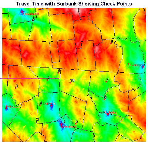
Notice that we returned to the "raw" travel time layer to check our time values - rather than the reclassified travel time layer. We wanted to look at the exact travel times from our reference points, not the 5-minute-interval travel time value represented in the reclassified travel time layer.
At this point, with the travel time map and check points superimposed, it would be possible using Cursor Inquiry in Idrisi, to window in and click on each point to see what the predicted travel time is. An easier method, particularly if we had a large number of checkpoints, is to use the EXTRACT module in Idrisi. A raster was prepared with background values of zero except that where each checkpoint was located, the checkpoint ID number was assigned to the pixel value. Thus there were only 10 pixels with non-zero values, which are located at our checkpoints. Using this checkpoints raster, EXTRACT was run to determine the travel times from each checkpoint to the nearest hospital. Extract produced a table of 10 travel time values (in minutes). We also had a table of the actual measured travel time.
We used the REGRESS module to quantify the quality of the model's predictions. REGRESS calculated a correlation (r-value) of 0.9870 and a Coefficient of Determination (r-squared) of 97.42%. These values indicate that the travel time model has done a fairly good job at predicting travel times. Later we attempted to improve our model and will compare the quality of predictions made by the improved model with these results.
We looked at how the travel time changed between the two scenarios - with Burbank Hospital present vs. Burbank closed. There was no difference between most of the travel times extracted from the travel-time-with-Burbank-present map and the travel-time-with-no-Burbank map. As we would expect, if the destination didn't change, the travel time didn't change. In the case of points 2,4, and 9, without Burbank Hospital, the travel time increased as the closest hospital became Leominster Hospital. The increases in travel time are exactly what local residents were concerned about; if Burbank Hospital were to be closed, travel time necessary to reach the nearest hospital would increase, which could potentially impose serious threats to health in emergency situations.
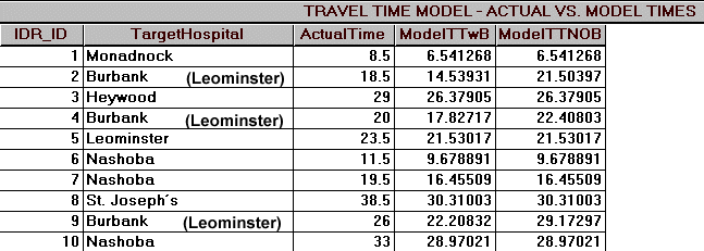
Figure 9. Comparison of Actual Travel Times with Predicted Travel Times
If you look again at the table, compare the fields ActualTime and ModelTTWB (modeled travel time with Burbank Hospital present), you can see by comparing the measured times with the times estimated using the travel time model that measured times exceed model times in nearly every case. Detailed quantification and analysis of the discrepancies between observed and predicted time values (error) are beyond the scope of this exercise, but we will qualitatively explore some options.
There are many directions we could have headed at this point to improve our travel time model and its validation:
Most of these options, and there are many more, would involve reworking the speed-per-cell and/or the travel-time-per-cell map and then working through the cost analysis and model verification again. This can be done iteratively until an acceptable level of error in predicting actual travel times is reached.
Examination of the error and its apparent spatial distribution led to the hypothesis that in developed, more urbanized areas driving speeds seemed to be lowered relative to our model speeds. Neighborhood stop signs and traffic lights added delays which were not reflected in the first model. An "Urbanization Factor" layer was prepared and used to modify the travel-time-per-cell map prior to rerunning COST to produce revised travel-time layers.
A description of the steps involved in the preparation of the "Urbanization Factor" layer - which was used to improve the accuracy of the travel time data layers, is provided as an Idrisi tutorial here. This section can be ignored if the reader is satisfied with a summary such as "more accurate travel time maps, similar to those already produced, were derived by adjusting travel speeds to account, essentially, for population density across the study area."
We completed Part 1 - the Travel Time Analysis. At this point we were satisfied that we have acceptable travel time maps. We were now prepared to look at the people who would be affected by the proposed closure of Burbank Hospital. How many of people were there and where were they located?
In Part 1, we created travel time maps for the two scenarios, with Burbank Hospital existing, and with Burbank Hospital absent. These maps showed the travel time to the nearest hospital, but it was not immediately obvious in some areas, which hospital would be closest to a given location on the map. Idrisi provides a module called ALLOCATE which resolves this problem. The way allocate operates can be visualized as follows: Imagine you have a raised-relief model of an area containing portions of several drainage basins and you want to differentiate which areas belong to which basins. You would locate the lowest point in the study area in each of the drainage basins. ALLOCATE 'travels' outward from each of the low points specified. As it goes it designates each pixel as belonging to the present drainage basin. When it gets to a drainage divide, it stops. Once this has been done for each of the drainage basin, the entire study area has been apportioned to one or the other of the basins; the boundaries between correspond to the drainage divides. A map such as this is produced:
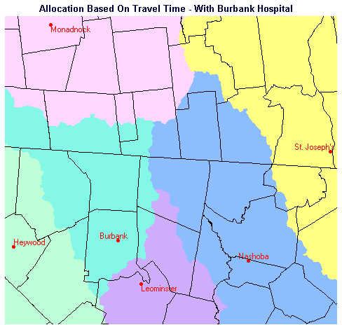
Figure 10. Allocation to Hospitals with Burbank Present
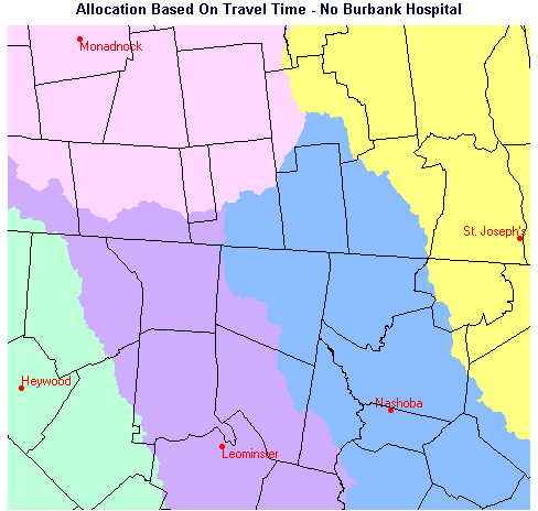
Figure 11. Allocation to Hospitals with Burbank Absent
If you compare the two maps, you will notice that most of the area allocated to Burbank Hospital when it is present is reallocated to Leominster Hospital when Burbank is not present. There is some enlargement of area allocated to the other hospitals when Burbank is removed, but not a great deal.
This map composition depicts the spatial allocation of the study area to hospitals based on travel time. By superimposing the ground truth points (CHECKPTS) from which we measured travel times to the hospitals, it was simple to visually confirm that the destination hospitals to which we measured times were, in fact, the correct hospitals. It was also possible to confirm that the only checkpoints which changed their allocation when Burbank does not exist are points 2, 4, and 9.
In Part 1, we created travel-time maps and determined the exact boundaries of areas allocated to hospitals based on travel time. In the allocation images we created, crossing a polygon boundary changes the hospital allocation instantaneously. In the real world, people may not be aware of or concerned about exactly which facility is closer. A person in the central portion of the study area may think Burbank Hospital is closer, when actually Nashoba can be reached in a shorter travel time. Also, a person may correctly believe that one hospital is closer, but it's only two or three minutes closer than another hospital and they would prefer to drive to Hospital B, given the insignificant difference in travel time.
If travel time is the criterion for deciding which hospital to attend, which is the key assumption for this investigation, we thought it important to take into account those people who may be unaware of exact travel times People living near the boundaries between hospital catchments are, presumably, the people most like to be unsure of or incorrect about which hospital is closer. We examined this by evaluating travel time buffers along the boundaries between the catchment areas, which were allocated based on travel time. We determined the region in which people are within three minutes of a hospital catchment boundary, along which two hospitals are equidistant based on travel time. We created three-minute buffers on each side of the catchment boundaries, (note that this will create six-minute-wide zones). The procedure could just as easily evaluate buffers of any desired time-width (e.g., five-minute buffers, ten-minute buffers, etc.). The procedure for creating the buffers using IDRISI is detailed as an Idrisi tutorial in a separate section, which can be consulted here.
The raster layers depicting the +/- 3-minute buffers are shown in Figures 12 and 13.
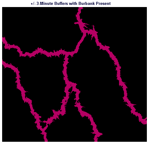
Figure 12. +/- 3-minute Buffers Along Catchment Boundaries with Burbank Present
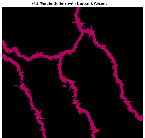
Figure 13. +/- 3-minute Buffers Along Catchment Boundaries with Burbank Absent
In the separate section referenced in the previous paragraph, we determined the three-minute-travel-time buffers around the boundaries between hospital catchment areas for the hospitals for both scenarios - Burbank Hospital present and Burbank absent. We will come back to these buffer maps when we look at the number of people occupying these areas.
We delineated the areas which contribute people to each hospital based on travel time - the catchment areas for the hospitals. We also determined the three-minute buffers around the boundaries of the catchment areas. We assumed that people who live in the buffer areas either do not know which hospital are closest or the difference in travel time between two competing hospitals is insignificant. In order to estimate the number of people in the catchment areas and buffer areas, we prepared a population density map. If we have a map showing how many people live in the area described by each pixel, then we could sum the values in all of the pixels in a given area to estimate the total number of people in that area. In our town information database, we had a field containing the number of people living in each town. We assumed for this investigation that people were uniformly distributed throughout each town. If a more in-depth analysis were required, it might have been possible to obtain census data for a more detailed evaluation of population distribution, e.g., at the blockgroup level or it might be possible to define a more detailed model to define the distribution of population within towns.
In all of the raster images we have been working with, the cell size is 50 meters in both north/south and east/west directions. 50 meters times 50 meters equals a cell size of 2500 square meters. We used these values to calculate, for each town, the population per cell.
In one step we divided the AREA (in square meters) of each town by 2500 to yield the number of cells in the town, and then we divided the Population by the number of cells to yield values which correspond to the average number of people who live in each cell in each town.
Next, we need to assign the values for population per cell by town to an image to create a population density map.
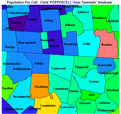
Figure 14. Population Density Map
Although Figure 14 is displayed using a quantitative palette, i.e., the color assigned to each town corresponds to its relative population density, it may be more helpful to look at the numerical values for population density in the table which follows. Towns are listed in order of increasing average population density.
| idr_id | town | pop | area | poppercell |
|---|---|---|---|---|
| 163.0000 | Sharon | 288.0000 | 37840491.2188 | 0.0190 |
| 152.0000 | Lyndeborough | 1294.0000 | 80400698.3359 | 0.0402 |
| 154.0000 | Mason | 1213.0000 | 62078629.7500 | 0.0489 |
| 33.0000 | Dublin | 1474.0000 | 75385441.3711 | 0.0489 |
| 164.0000 | Temple | 1205.0000 | 60782630.2734 | 0.0496 |
| 145.0000 | Greenfield | 1519.0000 | 67406941.5781 | 0.0563 |
| 1313.0000 | Hubbardston | 2797.0000 | 108720830.9336 | 0.0643 |
| 1331.0000 | Princeton | 3189.0000 | 92875613.2344 | 0.0858 |
| 157.0000 | Mont Vernon | 1812.0000 | 43734480.9844 | 0.1036 |
| 1180.0000 | Ashby | 2717.0000 | 62619396.0703 | 0.1085 |
| 141.0000 | Brookline | 2410.0000 | 52154686.6406 | 0.1155 |
| 160.0000 | New Ipswich | 3990.0000 | 85681356.1289 | 0.1164 |
| 166.0000 | Wilton | 3161.0000 | 66986815.5000 | 0.1180 |
| 38.0000 | Jaffrey | 5094.0000 | 103756778.7070 | 0.1227 |
| 44.0000 | Rindge | 5203.0000 | 103564205.2539 | 0.1256 |
| 1292.0000 | Ashburnham | 5433.0000 | 106249596.9648 | 0.1278 |
| 1193.0000 | Dunstable | 2236.0000 | 43371244.0781 | 0.1289 |
| 162.0000 | Peterborough | 5234.0000 | 98772741.4492 | 0.1325 |
| 1349.0000 | Westminster | 6191.0000 | 96752945.8867 | 0.1600 |
| 149.0000 | Hollis | 5705.0000 | 83715616.5234 | 0.1704 |
| 1350.0000 | Winchendon | 8805.0000 | 114198897.8672 | 0.1928 |
| 1196.0000 | Groton | 7511.0000 | 87358176.1328 | 0.2150 |
| 1314.0000 | Lancaster | 6661.0000 | 73042425.1875 | 0.2280 |
| 1221.0000 | Townsend | 8496.0000 | 85789597.2266 | 0.2476 |
| 137.0000 | Amherst | 9068.0000 | 90186824.0391 | 0.2514 |
| 1186.0000 | Boxborough | 3343.0000 | 26975626.1094 | 0.3098 |
| 146.0000 | Greenville | 2231.0000 | 17798745.8438 | 0.3134 |
| 1317.0000 | Lunenburg | 9117.0000 | 71753438.8906 | 0.3177 |
| 151.0000 | Litchfield | 5516.0000 | 40015307.8438 | 0.3446 |
| 1215.0000 | Shirley | 6096.0000 | 41197125.7500 | 0.3699 |
| 1202.0000 | Littleton | 7107.0000 | 45471089.9609 | 0.3907 |
| 1212.0000 | Pepperell | 10098.0000 | 60015723.8281 | 0.4206 |
| 1310.0000 | Harvard | 12329.0000 | 69871058.2266 | 0.4411 |
| 156.0000 | Milford | 11847.0000 | 65493504.7656 | 0.4522 |
| 213.0000 | Londonderry | 19781.0000 | 108627890.0859 | 0.4553 |
| 1222.0000 | Tyngsborough | 8640.0000 | 46751315.4297 | 0.4620 |
| 1227.0000 | Westford | 16402.0000 | 81154303.2656 | 0.5053 |
| 155.0000 | Merrimack | 22185.0000 | 86595076.2500 | 0.6405 |
| 150.0000 | Hudson | 19530.0000 | 75353393.8359 | 0.6480 |
| 1182.0000 | Ayer | 6837.0000 | 24790585.5938 | 0.6895 |
| 1307.0000 | Gardner | 20125.0000 | 59606834.3242 | 0.8441 |
| 1178.0000 | Acton | 17872.0000 | 52537884.0234 | 0.8504 |
| 1316.0000 | Leominster | 38145.0000 | 77105393.9297 | 1.2368 |
| 1306.0000 | Fitchburg | 44194.0000 | 72718657.1250 | 1.5194 |
| 158.0000 | Nashua | 79662.0000 | 82494464.0781 | 2.4142 |
| 153.0000 | Manchester | 99567.0000 | 90429610.5625 | 2.7526 |
Note that it does not matter if a town is not entirely contained within the study area. If only 10% of a town by area is contained within the study area, then if you summed up the values in all of the pixels in POPDENS for that town, you would be calculating 10% of the total population of that town. Recall that we have assumed that population is spread uniformly throughout each town.
Earlier we allocated the entire study area to hospitals, based on travel time, for each of two scenarios, one in which Burbank Hospital was present, and one in which Burbank was absent. In the allocation maps we created, ALLOWB and ALLONOB, each pixel contains the ID value of the hospital in whose catchment that pixel lies. For example, all of the pixels in the catchment for Monadnock Hospital have a value of 4 in both images.
Idrisi contains a module called EXTRACT which performs statistics on one image (the Image To Be Processed) based on areas with a single pixel value in a second image (the Feature Definition Image). We used EXTRACT earlier to determine the values of pixels in the travel time images corresponding to checkpoint pixel locations in the CHECKPTS image. In it was time to sum the values in the population density image (POPDENS) for all of the pixels present in each of the catchment areas. For example we wish to add up all of the people-per-cell values in POPDENS for all of the cells which correspond to cells with a value of 4 (Monadnock Hospital) in the ALLOWB image. EXTRACT yielded the following:
Population By Catchment With Burbank - ALLOWB EXTRACT on POPDENS
| Category | Hospital | Population within Catchment |
|---|---|---|
| 1 | Heywood | 24994.719954 |
| 2 | Nashoba | 65779.014135 |
| 3 | St. Joseph's | 135992.832204 |
| 4 | Monadnock | 16559.189015 |
| 5 | Leominster | 49053.693292 |
| 6 | Burbank | 55781.285707 |
Note that the numbers after the decimal point do not indicate fragments of people living in the target areas. The decimal places are an artifact of dividing populations by areas resulting in populations per cell that were decimal values, and which were generally less than one.
And for the case where Burbank Hospital is absent:
Population By Catchment Without Burbank - ALLONOB EXTRACT on POPDENS
| Category | Hospital | Population within Catchment |
|---|---|---|
| 1 | Heywood | 27525.704985 |
| 2 | Nashoba | 66333.207879 |
| 3 | St. Joseph's | 135992.832204 |
| 4 | Monadnock | 18400.912412 |
| 5 | Leominster | 99908.076828 |
Note that Category 6 does not exist in this table because Burbank Hospital, with an ID of 6, did not exist and therefore did not have a catchment area in the scenario which the ALLONOB allocation image represents.
Comparison between the two sets of results indicates that, according to our model and all of the assumptions we've made to this point, the portion of the Burbank Hospital catchment contained within the study area contains 55,781 people. In the scenario where Burbank Hospital is closed, those people were reallocated as follows:
| Hospital | Reallocation from Burbank (People) |
|---|---|
| Heywood Hospital | 2,531 |
| Nashoba Hospital | 554 |
| St. Joseph's Hospital | 0 |
| Monadnock Hospital | 1,842 |
| Leominster Hospital | 50,854 |
Note that there was a sliver of Burbank Hospital's catchment area which extended to the northwest beyond the limits of the study area. Anyone living beyond the limits of the study area is not reflected in the population estimates presented here.
We have not yet taken into account the people living within the three-minute buffer zones. We will consider those people next.
This image depicts the hospital catchment areas with the three-minute-travel-time buffer zones shown. Note that the areas (buffers) are divided along the catchment boundaries so the portion of buffer in each catchment is indicated. This differs from Figures 12 and 13, where areas within three minutes of a catchment divide are NOT differentiated by what catchment they are in.
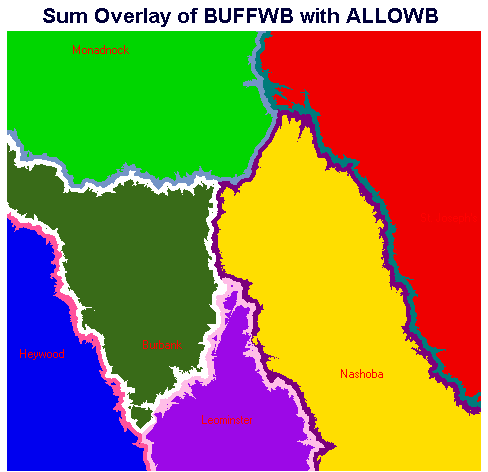
Figure 15. Hospital Catchment Areas with Buffers - Burbank Present
The IDRISI EXTRACT module was used to calculate the population totals in the catchment areas and buffers:
Populations Within Buffer Zones Around Hospital Catchments With Burbank
| Category | Hospital | Type | Population |
|---|---|---|---|
| 1 | Heywood | Catchment | 23126.559238 |
| 2 | Nashoba | Catchment | 59647.216169 |
| 3 | St. Joseph's | Catchment | 131559.288410 |
| 4 | Monadnock | Catchment | 14481.835473 |
| 5 | Leominster | Catchment | 42215.927558 |
| 6 | Burbank | Catchment | 47939.359847 |
| 11 | Heywood | Buffer | 1868.160716 |
| 12 | Nashoba | Buffer | 6131.797966 |
| 13 | St Joseph's | Buffer | 4433.543794 |
| 14 | Monadnock | Buffer | 2077.353542 |
| 15 | Leominster | Buffer | 6837.765734 |
| 16 | Burbank | Buffer | 7841.925860 |
Zone 16, 7,842 people, represents the number of people who are really closer to Burbank Hospital based on our travel time analysis, but who are only closer to Burbank by travel time of up to three minutes. The number of people within this buffer can be added to the number of people within the Burbank catchment who are not in the buffer, 47,939, to yield the total population within the Burbank catchment (55,781).
Repeating the procedure to determine populations for the scenario in which Burbank Hospital were closed yielded the following results:
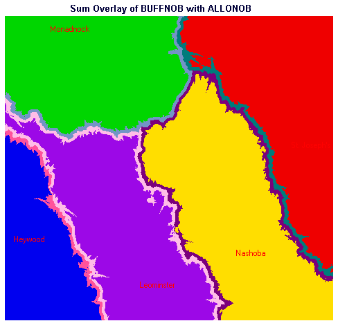
Figure 16. Hospital Catchment Areas with Buffers - Burbank Absent
Populations Within Buffer Zones Around Hospital Catchments Without Burbank
| Category | Hospital | Type | Population |
|---|---|---|---|
| 1 | Heywood | Catchment | 24754.527232 |
| 2 | Nashoba | Catchment | 60109.412209 |
| 3 | St. Joseph's | Catchment | 131506.986203 |
| 4 | Monadnock | Catchment | 16381.975709 |
| 5 | Leominster | Catchment | 92530.550943 |
| 11 | Heywood | Buffer | 2771.177752 |
| 12 | Nashoba | Buffer | 6223.795670 |
| 13 | St Joseph's | Buffer | 4485.846001 |
| 14 | Monadnock | Buffer | 2018.936703 |
| 15 | Leominster | Buffer | 7377.525885 |
This table indicates, for the scenario where Burbank Hospital is absent, the number of people located within each hospital's catchment who are not within a 3-minute buffer (Categories 1 - 5) and the number of people located within each hospital's catchment who are within approximately three minutes of a catchment boundary (Categories 11 - 15).
If we wish to determine the number of people who might be likely to travel from another catchment to a particular hospital, e.g., how many people there are in the section of the 3-minute Heywood Hospital buffer along the boundary with the Burbank catchment, additional investigation is required, as discussed in an Idrisi tutorial, which can be consulted here.
When local area residents were faced with the possibility that a local hospital (Burbank Hospital) and its emergency room would be closed, GIS, some basic assumptions, and some rudimentary data sets were used to quantify comparisons between two scenarios: 1) the facility existing, and 2) the facility closed. The study started with fundamental assumptions, e.g., that people in need will attend the hospital reached from their residence most quickly and that posted and assumed speeds can define a reasonable travel time model. Basic data sets which are readily available or could be created easily were used, consisting of town boundaries, streets, highways, and water bodies, hospital locations, and area and population statistics. A raster image covering the study area with 50-meter cells was prepared. Hospital locations within the study area were rasterized. Water bodies, background, and streets were rasterized into a second, matching raster, and the cells in which they fell were assigned model travel speeds of 1, 5, and 15 miles per hour (mph), respectively. Highways were then rasterized into the same raster image and assigned their posted speeds ranging from 40 to 65 mph. A conversion factor changed this raster to one with pixel values of travel time per cell.
Cost distance analysis produced travel time maps by replacing each pixel's value with the travel time accumulated in transit from hospital locations. This was performed for both scenarios, with Burbank existing and without. Evaluating discrepancies between predicted travel times and real-world observations, an "urbanization factor" raster layer was devised to slow travel times per cell in developed areas, while leaving travel times unaffected in rural areas. The factor layer was devised by creating an image with the distance to closest street in each pixel; urbanized areas had a predominance of low values. By aggregating pixels and smoothing these values this image was generalized. A threshold was determined and applied. Values larger than threshold were considered rural and assigned a value of 1; values below were urban and assigned 1.4.
The urbanization factor layer was multiplied by the travel time per cell layer and then cost distance analysis was performed again to produce improved cumulative travel time maps. From these maps, the mean travel time to hospital for each town in both scenarios was calculated. From the travel time maps, a catchment area (defined as the area for which a hospital is the closest hospital, based on travel time) was determined for each hospital for both scenarios. Using the catchment area maps and area and population statistics for each town, the total number of people in each catchment was determined for both scenarios.
To account for peoples' presumed uncertainty regarding exactly which hospital is closest, travel time maps were prepared with the origins of travel being the boundaries between the hospital catchment areas. We discarded all areas exceeding three minutes travel time from a catchment boundary and retained the three-minute buffer around the catchment boundaries. Given the distribution of population and locations of the three-minute buffers, we estimated the numbers of people, who, by virtue of being near a travel time divide, could be unpredictable in their hospital attendance. A method was explored for differentiating the individual segments of the catchment boundaries, buffer zones, and resident populations.