This project was undertaken to find a visually entertaining way to present date and location data in a dataset that I had been accumulating over a long period. The method used to create the present animation of hiking data derived from software tools and understanding available to me. No doubt there are more elegant or more expedient solutions, but the methods used in this case are described below.
For many years, I have kept a log of hikes and other exercise events. I keep track of the date and location, and often write comments when the situation warrants or if time permits. For runs or hikes involving mountains, I usually note the total time and time it takes to ascend, time spent on top, etc. For a traverse that involves multiple summits or significant points, I try to keep track of those time details as well.
In order to manage, analyze, and manipulate the data, I use a database program called Foxpro. A spreadsheet program, such as Excel, or another software platform could be used instead, but I use Foxpro, a database management system (DBMS).
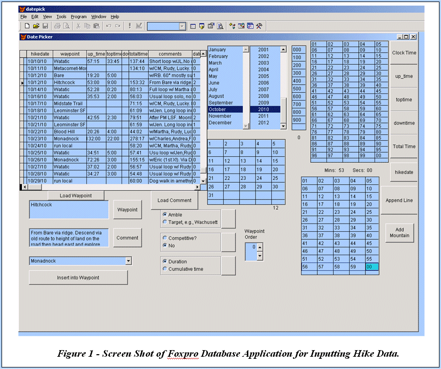
Data entry is generally a tedious task, and transforming my hike log into database records is no exception. To facilitate the process, I developed a program in Foxpro (see Figure 1). For me, it is faster to click on the data variables, such as date elements and numbers of minutes and seconds, than to type them in manually. Also, there are times when a comment or a hike location is repeated frequently and it is a nuisance having to retype it or copy and paste. This Foxpro data interface eases those procedures.
I have also had some success using Dragon speech recognition software to dictate data elements into Excel, and then importing the data into Foxpro.
Once the data is in the program, the DBMS, Foxpro, in this case, is used to group the data by month and count the number of times each destination occurs within that month.
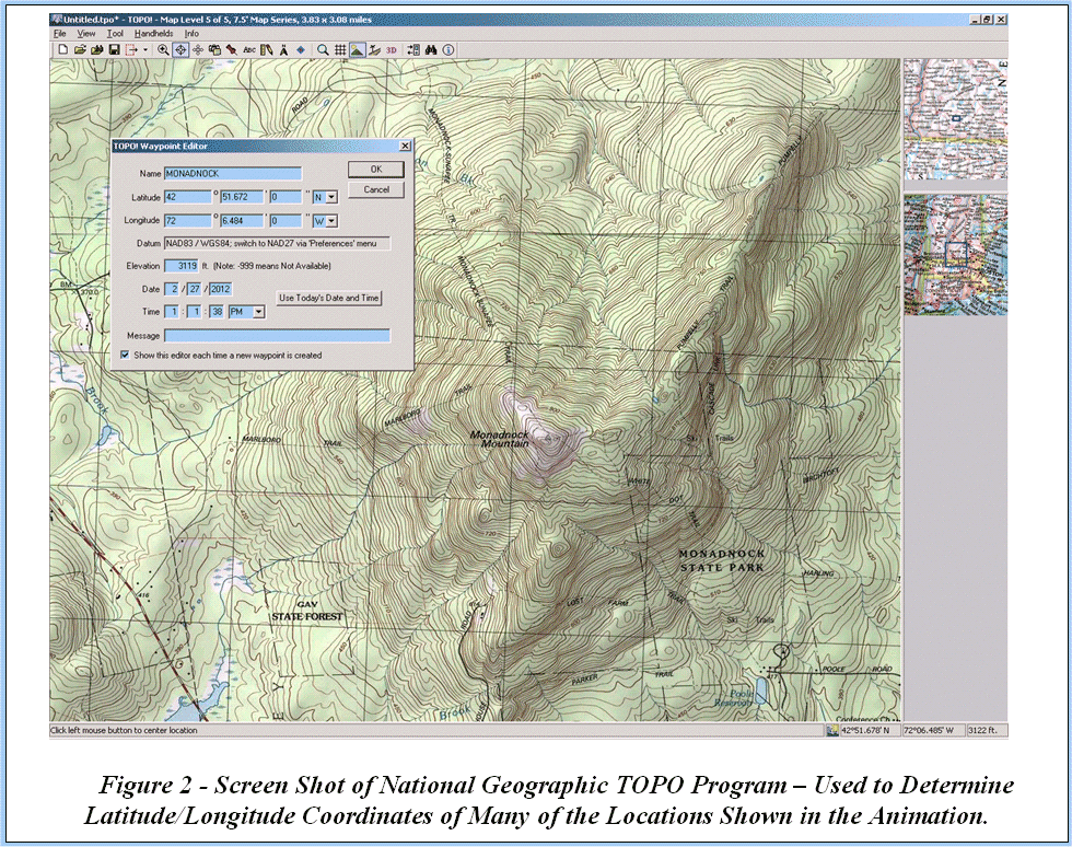
A database of locations was derived from the hikes database. Each unique location listed in the hikes database constitutes a record in the locations database. To plot these on a map, each place requires map coordinates (latitude and longitude, or lat/long). For some locations, I looked up the coordinates on the Web – occasionally on a paper map. For many locations in the Northeast (to where most of the data refers), I used a program called TOPO from National Geographic. I use the New England version. TOPO offers the capability to move around on a map and zoom in and select a point of interest, for which the lat/long is captured to a file. Figure 2 illustrates TOPO in use for this purpose. In a sitting, a number of locations can be selected and labeled, with the results contained in a single file that can be exported from TOPO and then imported into Foxpro. If consistent location names are used, the coordinate data can be linked to the main locations database and the coordinates inducted directly into the locations database, without the need to retype – or to copy and paste - them.
The base map for the present project was a low-resolution “digital elevation model”, which is just a fancy name for a data set consisting of elevation values at points that are regularly spaced. The base map, onto which the locations would be drawn, could be any kind of map image, as long as it satisfies the stipulation in the next paragraph.
In order to easily calculate where to plot a location on the map, it is essential that the basemap used for plotting corresponded to a Mercator projection, i.e., a vertical line on the map is a line of constant longitude and a horizontal line on the map is a line of constant latitude. In the real world, lines of constant longitude are not parallel, but converge toward the north and south poles. This means that using a map that represents longitude lines as parallel produces a distorted representation of reality, with that distortion more apparent the farther north (or south) you go from the equator. In this case, I accepted the trade-off between accuracy of representation and ease of implementation. (I chose “ease” over “accuracy”.) Given this decision, - and my Mercator map representation - it was a simple job to plot a target location by pro-rating its coordinates within the coordinate boundaries of the image. For example, if the horizontal map edges at the top and bottom correspond to 35 degrees along the south edge to latitude 45 along the north edge, then a point with a latitude value of, say, 43.2 degrees should plot (43.2 – 35) / (45 – 35) (equals 8.2/10, 0.82 or, in other words 82%) of the way up from the bottom to the top of the map. If the size of the map image is 200 pixels (dots on the screen) from bottom to top, then the latitude location, or Y-value I want to plot should be 82% of the way, or 164 pixels, from the bottom. A similar calculation provides the X-value for plotting the location on the map image.
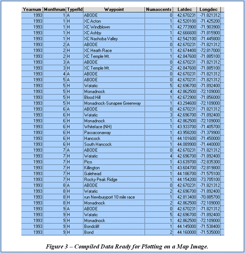
Foxpro was used to create a single data table like that shown in Figure 3. Each hike location that was visited within a single month was listed with the month, year, number of visits in that month, and location coordinates. Each month a record was also added to indicate where I lived at the time, a location included in the maps/animation.
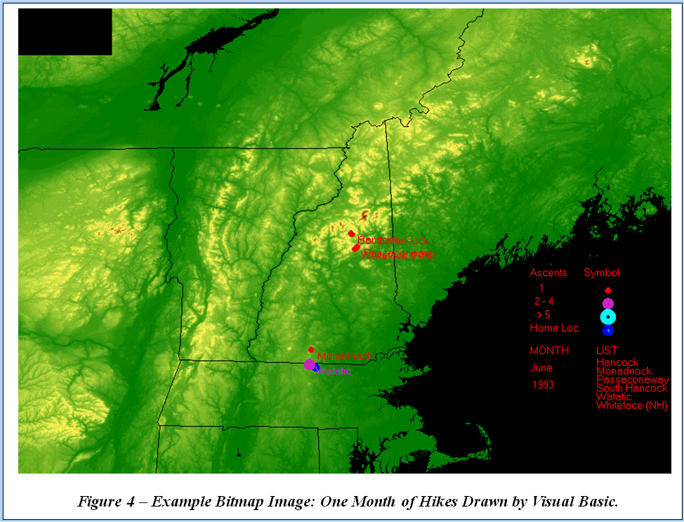
Visual Basic was used to draw the monthly maps that would be combined to form the animation. A program was written to draw the base map as a bitmap (.bmp) and then draw the data points onto the base map/bitmap. Visual Basic looked at the plotting datafile, which is shown in Figure 3. For each line of data, if the month number is the same as the one above, add the location point to the map and write the name of the location in the red list on the right side of the image. If the month number is different from the line above, then the previous month of data has ended so save out the previous month image and load a new base map and start drawing on it, and so forth. An example of a monthly image is shown as Figure 4. The program was set up to name the monthly images in such a way that the filenames would sort in date order.
Once the entire set of monthly images had been created, a program called JASC Animation Shop was used to assemble them into an animated .GIF file. Animated .GIF was selected as the target format because this type of file is easily viewed using most Web browsers, so no specialized software is required. Also, animated .GIF files tend to be fairly small, and therefore manageable. The software allows you to specify how long each image is displayed.
Clearly, there are many places in the process that improvements could be made. For instance, as the example image (Figure 4) shows, no effort was made to prevent overlapping or superimposed location labels. Also, a more appealing basemap might improve the quality of the resulting animation.
Some different applications of the general approach demonstrated here are presented in other animations on my web site: www.dataart.org.